Nowcast
Top 10 and Uniformly Weak 10
Same Dial, Opposite Direction
What the 10 healthiest states have that the 10 uniformly weak states don't. It isn't party, unions, or school spending.
In the first piece I called jobs, safety, and schools a state's operating system. In the last two I looked at the ends of the States nowcast. First, the Uniformly Weak 10: states in the bottom half on all three pillars. Then the top 10 on the blended rank.
This piece puts them side by side. The question is simple: what do the strongest states do differently from the uniformly weak ones?
- Top 10: New Jersey, Utah, New Hampshire, Rhode Island, Connecticut, Wyoming, Florida, Kentucky, Wisconsin, South Dakota.
- Uniformly Weak 10: Oklahoma, New Mexico, Nevada, Oregon, Alaska, Arizona, North Carolina, New York, Alabama, Michigan.
The short answer: they turn the same dial, in opposite directions. The dial is fiscal capacity.
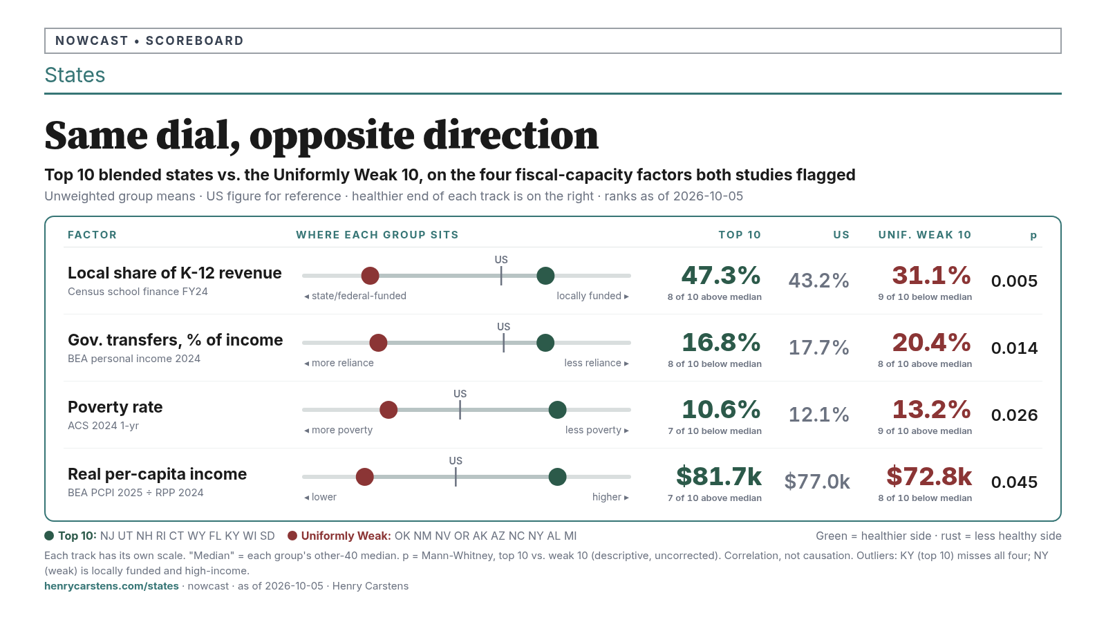
The dial: fiscal capacity
When I ran the two studies separately, the same three factors came out near the top of both lists. They just pointed in opposite directions.
1. Who pays for the schools. The top 10 get 47.3% of their K-12 revenue from local sources, mostly property taxes. The weak 10 get 31.1%. The US figure is 43.2%. Eight of the top 10 are above the median. Nine of the weak 10 are below it. New Hampshire is #1 in the country on local share (63.4%), Connecticut #2, Florida #4. Nevada (16.3%) and New Mexico (16.7%) sit near the bottom.
This is the cleanest split in the whole comparison (p = 0.005). Among the fiscal factors in the panel, local school share is one of the strongest 50-state correlates of the blended rank (|ρ| = 0.41). Absolute Spearman is larger for some demographic shares; those describe who lives where, not a fiscal dial.
2. How much household income comes from government transfers. In the top 10, government transfers make up 16.8% of personal income. In the weak 10 it's 20.4% (US 17.7%). Utah is the lowest in the country (12.5%), and Connecticut and Wyoming are also in the bottom four. New Mexico (24.6%) and Alabama (23.4%) are among the highest. Medicaid alone runs 3.1% of personal income in the top 10 versus 4.4% in the weak 10.
3. Poverty and real income. Poverty averages 10.6% in the top 10 and 13.2% in the weak 10 (US 12.1%). Adjusted for local prices, per-capita income averages $81.7k versus $72.8k (BEA national PCPI $77.0k, US RPP = 100 — not the unweighted 50-state mean of state proxies). New Hampshire has the lowest poverty rate in the country (7.2%). Connecticut and Wyoming have the two highest real incomes in the data. New Mexico and Alabama are both around $67k.
Those are the same three factors, measured the same way. The top 10 sit on the healthy side of the US on every one, and the weak 10 sit on the other side. That's why I call it a dial and not a list: income, transfers, local tax base, and adult education all move together. Think of it as one setting with several readouts, not four separate causes.
What does not separate them
What failed to split the groups matters just as much. These are the usual suspects in any argument about why one state does better than another.
- Party. The top 10 have 5 Republican trifectas, 3 Democratic, and 2 divided governments. The weak 10 have 2 Republican, 3 Democratic, and 5 divided. Both groups include deep-red and deep-blue states. Strength isn't a red-state story or a blue-state story. If anything, the top 10 lean toward unified government of either party, but with ten states a side, that hint is thin.
- Unions and right-to-work. Union membership averages 8.9% in the top 10 and 10.6% in the weak 10, which is no real difference. Six of the top 10 are right-to-work, versus five of the weak 10. The top 10 include union-dense Rhode Island and Connecticut (16.1% each) and South Dakota, the least unionized state in the country (2.3%). The weak 10 include New York, the second-most unionized (21.3%), and North Carolina, the second-least (2.5%).
- School spending per pupil. Top 10: $18.7k. Weak 10: $17.3k. That's statistically flat. New Jersey (#3 in the country at $27.2k) is #1 on the blended rank. Utah spends $11.3k (#49) and still ranks #6 on Schools. On the weak side, New York spends the most in the country ($31.9k) and Arizona spends $12.0k (#48). Where the school money comes from separates the groups. How much there is does not.
- Climate, hazards, and public land. Florida is in the top 10 despite being in the 91st percentile for expected disaster losses. Michigan and New York are in the weak 10 with some of the lowest hazard exposure in the country. Utah (63.1%) and Wyoming (47.7%) are among the most federally owned states, the same Western public-land profile that marks several weak states. Geography alone doesn't sort them.
Cost of living, growth, and urbanization don't separate them either.
One more pattern, handled carefully
The top 10 are also older and, on average, less racially and ethnically diverse (70.2% non-Hispanic white versus 56.3%). That describes who lives in these states. It is not a cause. It is tangled up with income, history, rurality, and how crime and test data get collected. The two biggest counterexamples are in the top 10: New Jersey is #1 on the blended rank at 49.5% non-Hispanic white, and South Dakota is in the top 10 with one of the largest American Indian population shares in the country (10.1%).
The outliers, honestly
No ten-state group is clean. Three states break the pattern, and they're worth naming.
Kentucky (#8) doesn't fit the top 10. On the fiscal dial it looks like a weak-group state. Government transfers are 25.4% of personal income (#3 in the country). Medicaid is the highest share of income anywhere (7.2%). Poverty is 15.6% (#5). Real per-capita income is $67.5k (#45). Its local school share (37.0%) is below the median. It misses all four factors on the chart. Kentucky ranks #8 because it is solidly middle-of-the-pack on everything (Jobs 11, Safety 14, Schools 22), not because it has high capacity. I don't know why yet. It's the clearest case in the set where policy or measurement, rather than structure, is probably the story. Rhode Island (#4) is a milder version: above-median poverty and transfers, carried mainly by Safety (#5) and Jobs (#9).
New York doesn't fit the weak 10. It funds schools locally (50.9%, higher than the top-10 average). Its real per-capita income ($84.8k) is #6 in the country. It is the top K-12 spender and one of the most unionized states. Its weakness looks different: high poverty (14.0%) alongside high income, population loss, a weak Jobs reading (#43), and low adult high-school completion. Treat it as its own case.
Oregon is half a fit. It shares the transfer, poverty, and income readings, and its local school share (37.7%) sits just below the line. On everything else it looks like a stronger state: well educated, unionized (15.1%), and high-cost. Its Jobs rank (#46) is doing a lot of the work. In Oregon, cost and jobs look like the questions to ask, more than capacity.
What this does and doesn't say
- Correlation isn't causation. These are 50 state-level data points, and the capacity factors move together. Nothing here proves that raising the local share of school funding would raise a state's rank.
- Schools is partly circular. Test scores track poverty, transfers, and adult education everywhere. Part of the Schools pillar's "explanation" is the pillar measuring the same thing again. (Transfers vs. Schools rank: ρ = +0.59.)
- The dial explains Safety and Schools, not Jobs. Jobs barely correlates with any structural factor. New Hampshire (Jobs 27) and Wyoming (Jobs 28) are in the top 10 on Safety and Schools alone.
- Small groups. With ten states a side, one swap moves the counts. The p-values are descriptive, and I ran about 60 comparisons.
Close
The story people expect, that it's about party, unions, or how much a state spends per student, doesn't hold up at either end of the scoreboard. What holds up is quieter: how much of a community's income it earns for itself, and how much of its schools it pays for from its own tax base. The strongest states are turned up on that dial, and the uniformly weak ones are turned down.
That doesn't tell any state what to do. It does tell you where to start looking.
See where your state sits: https://www.henrycarstens.com/states
— Henry
Method. Group means are unweighted. "Median" means each group's other-40 median from its own study. p-values are Mann-Whitney tests of the top 10 vs. the weak 10. Real income = BEA 2025 per-capita personal income ÷ BEA 2024 regional price parity. The US $77.0k tick is BEA national PCPI (RPP = 100), not the unweighted mean of the 50 state proxies (~$76.4k). Sources: Census Annual Survey of School System Finances FY2024; BEA SAINC/SARPP; ACS 2024 1-year; BLS Union Members 2025; NCSL; Ballotpedia (Oct 2026); FEMA NRI v1.20; CRS R42346. Full tables are in the two companion studies.